Chapter 5 TESTING NORMALITY
Chapter Links
Assignment Links
Required Packages
library(tidyverse)    # Loads several very helpful 'tidy' packages
library(haven)        # Read in SPSS datasets
library(psych)        # Lots of nice tid-bits
Example: Cancer Experiment
The Cancer dataset was introduced in chapter 3.
5.1 Skewness & Kurtosis
The psych::describe() function may be used to calculate skewness and kurtosis.
cancer_clean %>%
  dplyr::select(age, totalcw4) %>%
  psych::describe()
vars n mean sd median trimmed mad min max range skew
age 1 25 59.64 12.93 60 59.95 11.86 27 86 59 -0.31
totalcw4 2 25 10.36 3.47 10 10.19 2.97 6 17 11 0.49
kurtosis se
age -0.01 2.59
totalcw4 -1.00 0.695.2 Shapiro-Wilk’s Test
The shapiro.test() function is used to test for normality in a small’ish sample. This function is meant to be applied to a single variable in vector form, thus precede it with a dplyr::pull() step.
If \(p-value \gt \alpha\), then the sample does NOT provide evidence the population is non-normally distributed.
cancer_clean %>%
  dplyr::pull(age) %>%
  shapiro.test()
    Shapiro-Wilk normality test

data:  .
W = 0.98317, p-value = 0.9399
If \(p-value \lt \alpha\), then the sample DOES provide evidence the population is non-normally distributed.
cancer_clean %>%
  dplyr::pull(totalcw4) %>%
  shapiro.test()
    Shapiro-Wilk normality test

data:  .
W = 0.9131, p-value = 0.03575
5.3 Histogram
Histograms provide a visual way to determine if a data are approximately normally distributed. Look for a ‘bell’ shape.
cancer_clean %>%
  ggplot(aes(age)) +
  geom_histogram(binwidth = 5)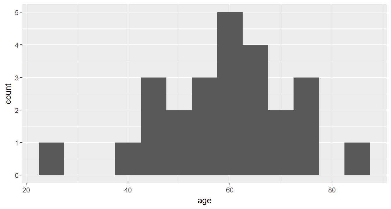
cancer_clean %>%
  ggplot(aes(totalcw4)) +
  geom_histogram(binwidth = 1)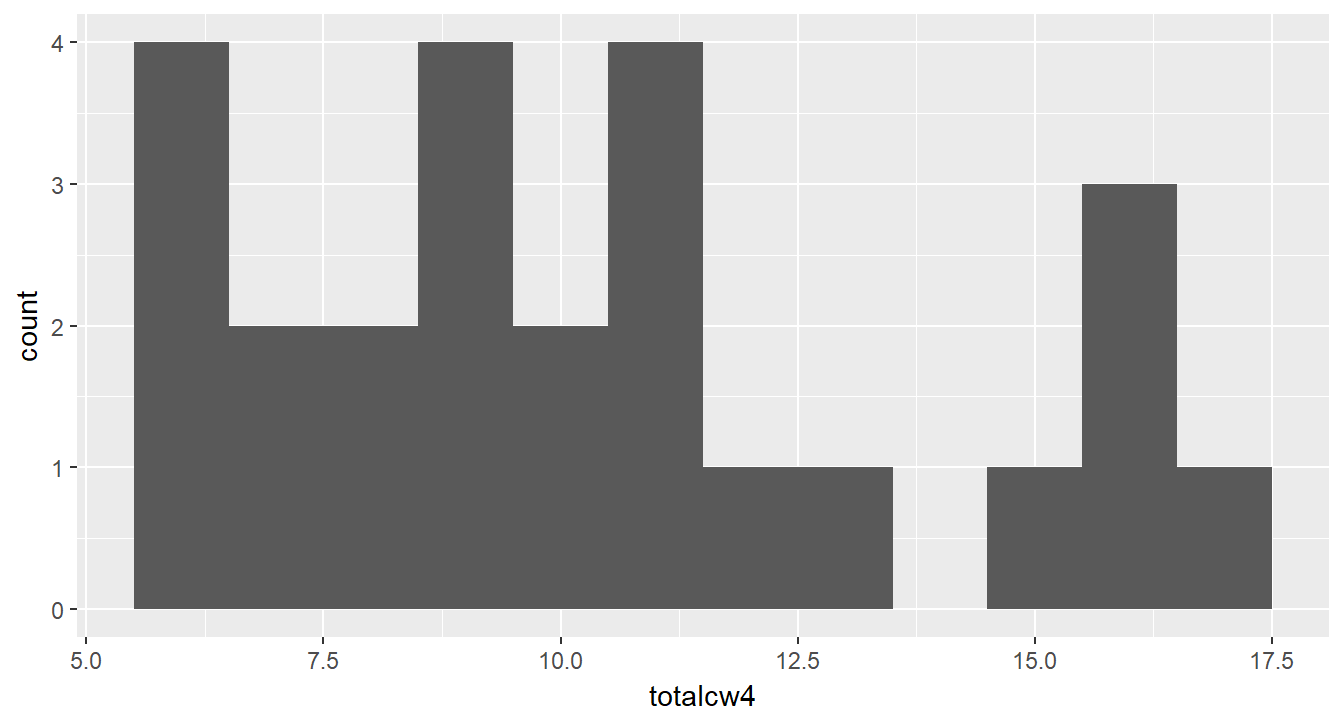
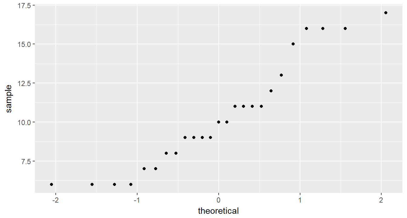
5.4 Q-Q Plot
Quantile-quantile plots also help visually determine if data are approximately normally distributed. Look for the points to fall on a straight \(45 \degree\) line.
cancer_clean %>%
  ggplot(aes(sample = age)) +
  geom_qq()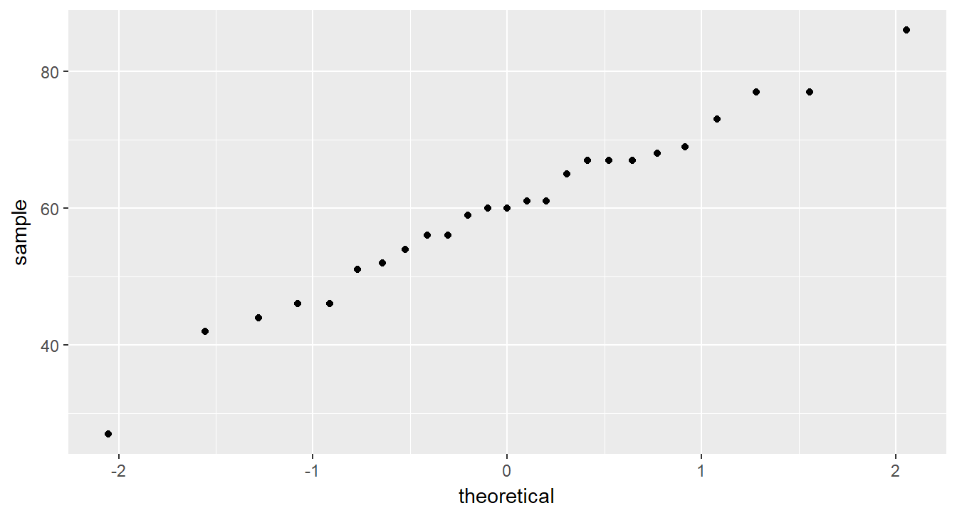
cancer_clean %>%
  ggplot(aes(sample = totalcw4)) +
  geom_qq()